Aviation Engine Diagnostics


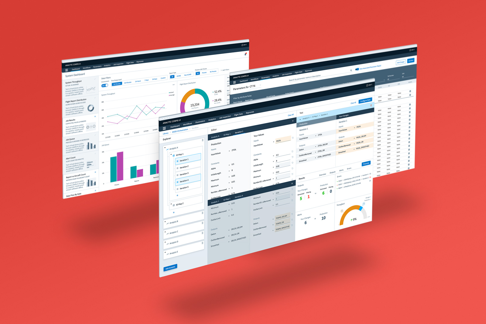
A top aircraft engine supplier with a growing number of advanced engines needed to revamp the aging architecture of the data pipeline used to process in-flight engine diagnostics, a cornerstone of their Support Division. The new architecture also required an updated interface that combined three legacy tools with new functionality and methods for interacting with flight data. Working with another designer and a researcher, I led that effort.
My Contributions:
My team and I started our discovery by first interviewing business stakeholders and SMEs familiar with the new and aging architecture. After getting a basic understanding of how they used the data, we then sat with our users to learn about their workdays and what they liked and disliked about the legacy tools.
We found one of the most frustrating issues for the support technicians' lied in their inability to see how their work changed these massive datasets for several weeks. The legacy tools hid their outcomes in a "black box"; a disaster for users. For that reason, we made transparency, robust testing capabilities, and system monitoring to predict downtime and errors the focus of our design.
We defined our proposed solution and presented it to our stakeholders, SMEs, and users. The design was well-received, but I made a mistake by not getting feedback from the team building the architecture. I learned an important lesson; make no assumptions and look for SMEs outside of those identified by the project stakeholders.
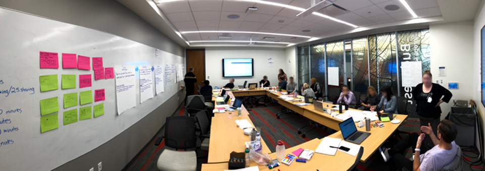
With feedback from our stakeholders, we refined our user flows and began to design the UI. We created wireframes to visualize the components of each screen. With each "completed" screen, we went back to our users for feedback. We also held co-design sessions with our users and developers as we iterated and explored the many possibilities until everyone agreed we'd hit the mark.

Our users need to see the big picture when making changes or adding new analytics to the system. The ability to view and edit the various components of a workflow in one place increases users' understanding and confidence when using the app, reducing errors and downtime.
Key Features:
Support technicians want a more transparent system to make troubleshooting performance issues easier. They also need transparency into the data pipeline to know what reports are pending to have a more holistic view of the data.
Key Features:
To understand the effect of their changes, support technicians need to see trends over time rather than single outcomes. We provided a "safe space" to test their changes against up to six months of production data without affecting the system.
Key Features:
As a designer, relationships are everything. Maintaining a good relationship with users is required and obvious, but having a good working relationship with those who may seem tangential to the project can be just as important. In hindsight, it seems obvious the team building the new pipeline should've been more involved early on. I eventually pushed to get a few key team members to attend our weekly reviews and sprint planning, which helped us get on the same page. And by maintaining good relationships with the development team, we make it clear we welcome their ideas and feedback, making both the team and product better.