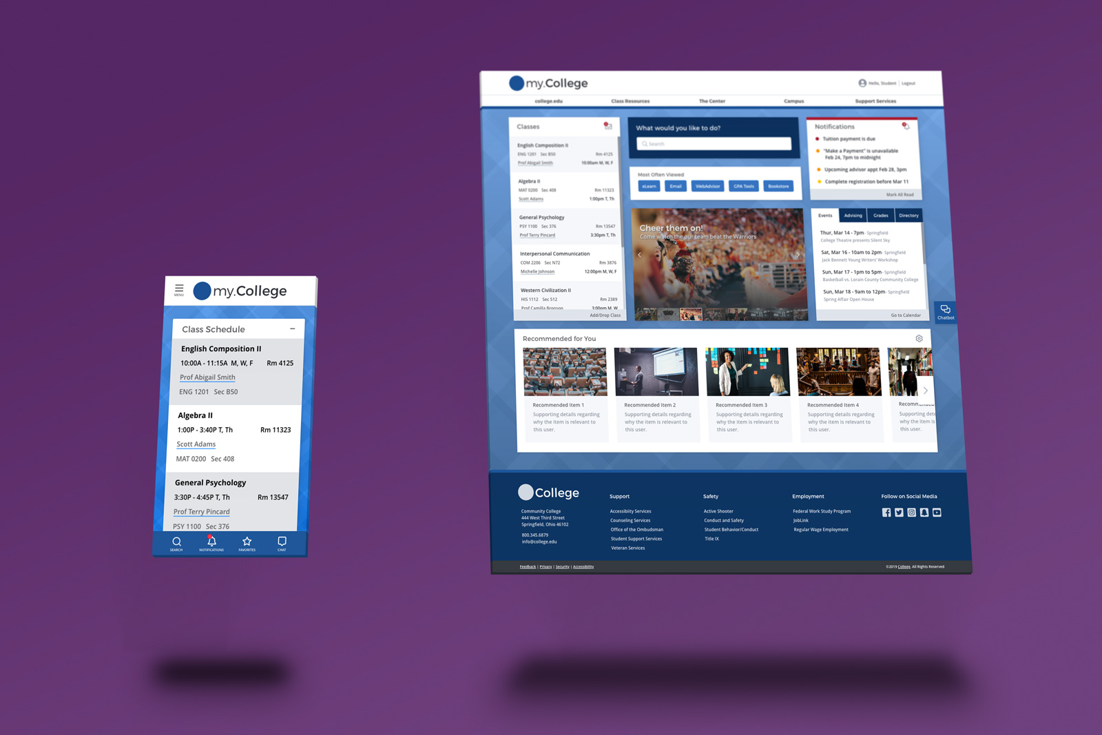
College Portal Redesign


Concerned administrators at a community college feared the recent changes to a student web portal had hurt its usability. Asked to improve the UX for this single screen, I soon realized issues outside of the portal, such as the navigation using an unclear taxonomy, creating issues. So the challenge for me became not only solving the portal's usability issues but convincing the administrators their marketing team might be contributing to the problem.
My Contribution:
To understand the problem, I interviewed several students and faculty members to discuss their experiences with the portal. The complaints ranged from "I can never find what I'm looking for" to "I can't do much here. It's just a bunch of links".
Through the variety of complaints, it became clear the navigation presented several problems. Almost everyone mentioned how hard it was to find the things they needed. At best, the navigation was unclear. At worst, it prevented people from discovering what they needed. The results of a survey I sent out reinforced this finding. Students and faculty both considered "easy to navigate" the most important characteristic of the portal redesign.
Although I had ideas for a clear taxonomy for the navigation, I knew getting the users directly involved would ensure the new navigation matched their thinking. I ran several card-sorting exercises with students and faculty to understand their mental model for grouping the different services offered by the school. Excited to participate, the students decided how the links would be categorized and helped brainstorm names for categories and sub-categories, providing greater clarity and specificity.
While creating the wireframes, and eventually, the prototype, I took every chance to put the representations in front of students and faculty. Using their feedback and ideas, I continuously iterated on the design and incorporated their ideas when they made sense. In the end, they not only made the design better, but the students were happy to see so many of their suggestions added to the design.
The portal redesign took the enormous amount of information and resources the college offers students and made the information easier to find, understand, and take action, if needed, from a central location.
Key Features:
The added features introduced new functionality and components not present in the mobile version of the previous design. By using a progressive web app approach and borrowing from mobile design patterns, I made the most of the limited space without sacrificing functionality.
Key Features:
The main navigation for the portal used ambiguous terminology and made the navigation less than helpful. Many users were surprised when I showed them some of the links they used in the portal were also in the navigation. By providing additional information directly within the navigation, we removed much of the confusion.
Key Features:
This project made it clear getting users involved early and often is necessary to create a product they'll find useful and enjoy. Even their feedback on rough sketches can produce valuable information and insight. Also, time spent learning about users' everyday life can provide a clear understanding of where and why they use your solution. It helps you empathize with the people who use your product while fostering rapport with them, paving the way for clear, honest feedback.