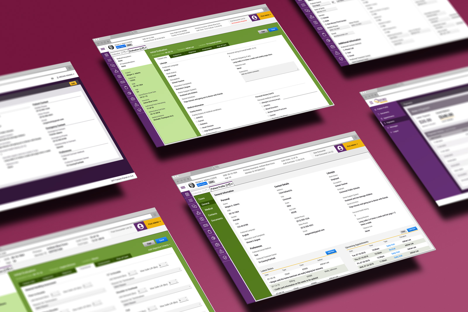
Physical Therapy EMR Platform


A growing physical therapy practice needed an EMR platform tailored to their specific needs. They wanted to build a tool that worked for them after years of settling for solutions intended for doctors' offices and hospitals. The project included general business concerns (scheduling, tracking referrals, billing, etc.) and requirements specific to physical therapy practice (injury evaluations, therapy progress, etc.). At the time, the client used an aging, unsupported tool, along with paper forms to capture and track their data.
My Contribution:
I kicked the project off by conducting on-site interviews with the different user groups: physical therapists, receptionists, and billing specialists. I learned a lot by simply watching them use the legacy software while they interacted with patients. I felt how overwhelming the front desk could be when juggling scheduled and walk-in patients in need of help. I could see the look of resignation as the legacy tool slowed to a crawl or crashed entirely.
Those conversations and observations gave me invaluable insight into the tasks they performed, their frustrations, and how they thought about their work. All of this helped me understand the larger processes and allowed me to define the screens and features they needed to help their patients from intake to billing.
After defining the functionality they would need, I got down to brainstorming on the UI design. I started with simple wireframes to visualize the basic ideas. When I felt confident I had a decent understanding and had addressed the users' needs, I built an interactive prototype to test with users on-site. Their feedback forced me to question my assumptions and iterate.
Our users needed a central hub to view and edit their patients' information. The UI had to help them find and access the assortment of data for each case while requiring as few "clicks" and scrolling as possible.
Key Features:
The physical therapists wanted a workflow that followed the SOAP protocol. The tool needed to make evaluating an injury and creating a treatment plan more intuitive and less time-consuming.
Key Features:
The billing specialists needed to see all of the patient's financial transactions and quickly discern which charges or payments connected with each visit to expedite the claims process.
Key Features:
Business processes that combine analog and digital technologies present a real challenge for designers. And there is no substitute for sitting with users and learning their stories. By interviewing and observing them, we can slowly unravel that twisted knot. Also, asking questions and encouraging users to express their ideas inspires them to find their voice and challenge your ideas, leading to a better product.